

advanced accessibility patterns for vibe coding
adding labels is the floor, dude! where's the ceiling?

If you don’t really care about reading the article, you can download the skill file from my Gumroad for free here → https://vainmaa.gumroad.com/l/accessibility-skill-file and just try it out!
But I’m like, really funny, so you should still read the post.

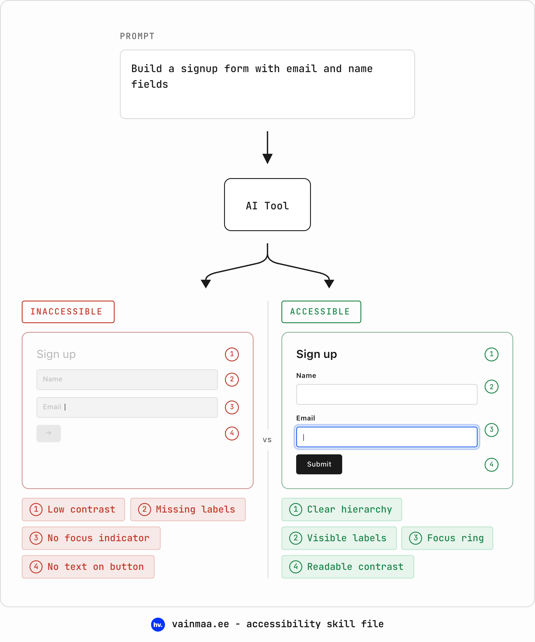
AI-generated interfaces tend to be visually impressive and structurally broken. They include all kinds of shit like buttons that aren’t actually buttons, text you can barely read if you’re over 28 or standing in sunlight, forms with no labels, and no keyboard support at all. Basic design skills touch on accessibility lightly, but really, we should be going way, way beyond that. Literally no excuses in 2026!
An estimated 1.3 billion people – one in six of us – experience significant disability. Inaccessible design excludes them. Disability is not a fixed category you are either in or out of: you age into it, you get injured into it, you are situationally in it every time you hold a baby in one arm or squint at your phone in direct sunlight. Designing accessibly is designing for everyone, including future you.
the baseline: a skill file and WCAG
I won’t walk you through every WCAG criterion here – others have done that well already, and you should read them:
WCAG 2.1 Quick Reference – the official, filterable reference
WebAIM – practical guides, contrast checkers, the annual Million report
The A11Y Project – community-maintained checklist and learning resources
MDN Accessibility – if you learn by reading docs
What I will give you is the skill file that includes all the basics. It is a Markdown document you save once and attach to your AI agent (a Cursor rules file, Claude project instructions, GPT custom instructions – whatever you use). The file encodes the WCAG AA rules as instructions for the agent (that’s contrast ratios, semantic HTML, keyboard navigation, ARIA, skip links, forms, motion preferences, touch targets, live regions).
If you don’t know, a skill file always has a consistent structure: a description that tells the agent when to activate (any task that produces UI), a working model (what to consider before generating), the rules themselves organised by domain, hard non-negotiables, known failure patterns, and litmus checks at the end.
I do want to make one thing clear, though: WCAG compliance is the floor – a “congratulations, your building has a ramp” level of achievement. A skill file that only encoded the baseline would keep you safely on that floor. And with the tools we have in 2026, staying there has become a choice: the cost of going further has dropped so dramatically that if you’re not going the extra mile, I really really want to know – why not? That is why the file doesn’t stop at the baseline.
So let’s talk about that extra mile.
the exciting stuff beyond the first pit stop of compliance
Everything in this section used to be technically painful, prohibitively expensive, or simply impossible to maintain – until AI tools made it trivial. I argue none of it is optional any more, because there is literally no good reason not to. You could… JUST… make your products easy to use. Sick!
contextual alt text that actually means something
AI-generated text usually looks technically accurate and contextually useless: “A woman smiling at the camera”.
Alt text isn’t supposed to describe what an image depicts – it’s supposed to describe what the image communicates in context. A headshot on a team page means something different from the same headshot on a keynote announcement; “a woman smiling” tells a screen reader user nothing about why the image is there.
Your AI agent can see the image and understand the surrounding page context. It can generate alt text like “CEO portrait alongside the company’s founding story” or “before-and-after comparison showing the redesigned dashboard” – purpose-driven descriptions that tell the user what they would otherwise miss, and why the image needs to be there.
For the skill file:
- Generate alt text that describes the image's role on the page,
  not just its visual contents. Ask: "What does this image
  communicate in context? What would the user miss without it?"
- For team photos: include the person's name and role.
- For product screenshots: describe what the screenshot
  demonstrates, not pixel-by-pixel contents.
- For charts and data visualisations: summarise the key insight
  or trend in the alt text, and provide a data table as an
  accessible alternative.
This level of alt text used to require a human writer to sit down and consider every single image in context. Now your agent does it as part of the generation process. I see genuinely no reason for bad alt text to exist any more.
(*Naturally, if you’re adding people’s names on group photos etc, some of it needs to be checked. Don’t start leaving stupid comments.)

automatic reading level adaptation
This is the coolest one.
WCAG AAA includes a reading level criterion – 3.1.5 – recommending that content be provided at a lower secondary education reading level, or that a simplified alternative be offered. Almost nobody meets this, and the reason has always been economics: maintaining two versions of everything is expensive. Every time the main copy changes, the simplified version has to change with it. Nobody has budget for that. Except now your agent can simply do it!
You can ship a “simplified language” toggle -- the LLM restructures sentences, replaces jargon with plain terms, breaks up compound ideas. Unlike a human writer maintaining parallel copies, the agent can regenerate the simplified version every time the source copy changes. You should actually probably be doing this to your content, anyway. One really good example of this in practice is actually without the toggle by Pinterest — their ToS page has simpler language that also functions as summaries.
Simpler language serves everyone – non-native speakers, people with cognitive disabilities, people who are tired, people reading on their phone while walking. But it matters most for the people WCAG 3.1.5 was written for: users with learning disabilities, low literacy, or cognitive processing differences, who cannot access the content at its original reading level at all.
For the skill file:
- Write all body copy at or below a Flesch-Kincaid grade level
  of 8. Avoid jargon; define technical terms on first use.
- Where content must be complex (legal, medical, technical),
  provide a plain-language summary at the top.
- When building content-heavy pages, include a "Simplified
  language" toggle that rewrites visible copy at grade level 5–6
  while preserving all information.
personalisation panels
Here is something that used to take a sprint to build properly: a settings drawer where users control their own experience. Font size, line spacing, colour scheme, animation on or off, high contrast mode – all at the app level, without relying on OS settings.
Why does this matter when OS-level settings exist? Because the cascade is broken. prefers-reduced-motion works well if the user knows it exists, can find it in their OS settings, and the web app actually responds to it – a big “if”, that last one. prefers-contrast has even patchier support. prefers-color-scheme gets you light and dark, but what about users who need a specific high-contrast palette that isn’t simply “dark mode”?
An in-app personalisation panel gives users direct control without asking them to navigate OS-level settings that may or may not cascade correctly into your web app. Building one used to be a meaningful engineering effort – a settings UI, localStorage persistence, a CSS variable system, consistent application across components. Now you can prompt it into existence in an afternoon.
Of course, always also take the OS-level settings into account and try to play nice.
For the skill file:
- Include an accessibility preferences panel accessible from the
  main navigation. Minimum controls: font size (3 steps),
  line spacing (normal / relaxed / wide), animation (on / off),
  colour scheme (light / dark / high contrast). Persist
  selections in localStorage.
- Apply preferences via CSS custom properties so they cascade
  consistently across all components.
- Ensure the preferences panel itself is fully keyboard-accessible
  and screen-reader-announced.


real-time accessibility auditing in the loop
This one is a feature for your process instead of your users, pretty obvious for a skill file.
You can add a rule to your skill file that tells the agent: after generating UI, run an accessibility audit on your own output and fix every violation before showing it to me. The agent tests its own work and catches its own mistakes & the output you receive has already been through a linting pass. Tools like axe-core run headlessly, and your agent can invoke them programmatically.
Is this perfect? No. Automated tools catch perhaps 30–40% of accessibility issues – the rest require human judgment. But catching 30–40% automatically is dramatically better than catching none because you’ll never remember it later.
For the skill file:
- After generating any complete page or component, run an
  automated accessibility audit (axe-core or equivalent).
  Fix all violations before presenting the output.
- If any violation cannot be fixed automatically, flag it with
  a comment explaining the issue and the recommended manual fix.
captions and transcripts: literalllly no excuses left
AI transcription in major languages* is good enough now that there is no reason left to ship video or audio content without captions. I will say it plainly: shipping media content without captions in 2026 is choosing to exclude people. It’s not only for people who are hard of hearing, either; I have ADHD and for me, captions are often essential to follow along. And maybe you’re just in bed with someone sleeping next to you! Only good things come from captions.
This used to require either expensive transcription services or painful manual work. Now, your agent can generate a <track> element with WebVTT captions for any media content it produces or embeds; for live content, real-time transcription APIs exist; for pre-recorded content, batch transcription is a solved problem.
*Yeah, if you’re doing it in Estonian, you will need to do it by hand.
For the skill file:
- No <video> or <audio> element without an associated <track>
  element for captions/subtitles.
- For pre-recorded content, generate WebVTT captions covering
  all spoken dialogue, meaningful sound effects, and speaker
  identification.
- For user-uploaded media, prompt for or auto-generate captions
  and allow user editing.
- Provide a visible, keyboard-accessible toggle for captions.
cognitive load adaptation
Not everyone processes information the same way, and not everyone needs the same density of interface at the same time. Progressive disclosure – showing the essentials first and letting users expand for more – has been a design pattern forever. But building two versions of every component (simple and detailed) was expensive enough that most teams only did it for their most complex screens, if at all.
Now you can generate both versions from a single prompt: a dashboard with everything on it, and a dashboard with the three things that matter most; a settings page with the critical options visible and the power-user options collapsed; a form that shows three fields initially and reveals the optional ones on request.
This is especially valuable for users with cognitive disabilities, ADHD, or anxiety – and for anyone overwhelmed by too many options at once, which is most of us, some of the time. But it is also simply better design: the best interfaces show you what you need when you need it.
For the skill file:
- Default to progressive disclosure for complex interfaces:
  show essential content first, provide clear expand/collapse
  controls for additional detail.
- Provide a "simplified view" option for dashboards and
  data-heavy pages that surfaces only the most critical
  information.
- All expand/collapse controls must have descriptive ARIA
  labels (e.g. aria-expanded="false",
  aria-label="Show advanced options") and be keyboard-operable.
- Never auto-expand collapsed content without user action.
focus-aware animation
Let me get specific about a pattern that has been technically possible for years but is almost never implemented: animations that respect both the user’s motion preference and whether the element is actually visible.
Most animations fire when the page loads, whether or not the element is anywhere near the viewport. This is wasteful at best (performance) and harmful at worst (motion sensitivity). The correct pattern combines prefers-reduced-motion with IntersectionObserver – animations only play when the element scrolls into view, and only if the user hasn’t requested reduced motion.
This is trivial to encode as a default behaviour: one rule in your skill file, and every animated element your agent generates follows the pattern automatically.
For the skill file:
- All scroll-triggered animations must use IntersectionObserver
  to play only when the element enters the viewport.
- Combine IntersectionObserver with
  @media (prefers-reduced-motion: no-preference) so animations
  are both viewport-aware and preference-aware.
- When reduced motion is preferred, replace animations with
  instant state changes — no fade, no slide, just appear.
- Never use animation-delay on elements that may be below the
  fold; use IntersectionObserver thresholds instead.
error recovery, not just error messages
WCAG requires that error messages describe the problem and suggest a fix. That is the baseline. What AI tools actually make possible goes further: fixing the error for the user.
When a form field has a predictable fix – a typo in an email domain, a date in the wrong format, a postal code with a stray space – the agent can generate a suggestion instead of a complaint. “Did you mean mari@gmail.com?” rather than “Invalid email address.” Auto-formatting that corrects as you type instead of rejecting after you submit. Smart defaults that reduce the chance of errors in the first place.
This matters enormously for users with cognitive disabilities, dyslexia, or motor impairments, for whom identifying and correcting errors takes more effort. But again – it is simply better design for everyone. Nobody likes forms that scold them.
For the skill file:
- Error messages must describe the problem, show the expected
  format, and suggest a correction where possible.
- For common input formats (phone, email, date, postal code),
  implement auto-formatting that corrects as the user types
  rather than rejecting on submit.
- Where the correct input can be inferred (e.g. "march 15"
  for a date field), offer a "Did you mean…?" suggestion
  instead of displaying an error.
- Prefill smart defaults based on locale and context to reduce
  error likelihood.
accessible data visualisations
Charts and graphs are among the most consistently inaccessible elements on the web. A screen reader user encounters a <canvas> element rendering a bar chart and gets nothing – silence. A pie chart built in SVG without any text alternatives is a colourful void.
AI tools can now generate data visualisations that include their own accessible alternatives automatically: a data table behind the chart, ARIA labels on SVG elements, a text summary of the key insight.
For the skill file:
- Every chart or data visualisation must include an accessible
  alternative: a visually hidden data table with the same
  information, OR ARIA labels on interactive SVG elements,
  OR a text summary describing the key trend/insight.
- Use aria-label or aria-labelledby on the chart container
  with a description of what the chart shows.
- Never use colour as the sole differentiator in charts.
  Pair colours with patterns, labels, or direct annotation.
- For interactive charts, ensure all data points are
  keyboard-navigable with aria-live announcements for the
  currently focused data point.
the file and the end
you can download the skill file from my Gumroad for free here → https://vainmaa.gumroad.com/l/accessibility-skill-file (but you can totally leave a tip. i’m currently unemployed)
well, anyway
hope you know how to use skills for agents. and anyway, subscribe etc.